Thursday, September 16, 2010

Top Chef and the Free Desserts

Last month I worked with the good folks at Arsonal, www.arsonalla.com, to create the final artwork promoting Bravo's new cooking show, "Top Chef Just Desserts". In addition to the usual magazine ads this campaign entailed a tie-in with the current Food Truck craze by hiring trucks in New York, Chicago and Los Angeles on the day of the shows premiere, September 15th. Basically the idea was that by following a Twitter Feed fans in these cities could track down the trucks and be rewarded with a free dessert. Yum!


For the Art Director, Tony, and I this meant creating artwork to wrap around the sides of the trucks. With 4 different trucks each with 4 different sides this meant creating 16 separate pieces of high resolution finished art, Whew!

Since the various designs were built around the cast members I first created separate files for each of the cast members and did all the stripping out and retouching there saving each one as a Smart Object. The biggest challenge, though, was in working with the Frosting that created the border for each of the images. Since the frosting had been shot using a couple of hot lights and a hand held camera there weren't many sections that had the nice, sharp detail we wanted. Add in all the twisting, warping and distorting Tony had done to the shots and you can imagine what it all looked like.

The biggest problem was that the frosting part of the image was going to be seen big and up close by all the folks waiting in line to get their free desserts so it had to look good. After working through all the noise reduction & sharpening techniques I normally used I found I still needed to find a way to bring out the subtle detail in the frosting. That's when a conversation I'd had long ago with a photographer friend, Jim McHugh, came to mind. Jim had come to one of my workshops a few years ago and he often reminds me how much my tip about using the Find Edges filter has helped him when he's working on his own images.

The Find Edges filter is often used as a way masking off sharpening effects so you can go a little heavier with the sharpening without worrying about creating problems in the areas you don't want sharpened. That's because the Find Edges filter creates something that looks like a white image with dark lines wherever it finds the edges in the image. Here's an example of what Find Edges did to the Frosting layer I was working with:


Normally retouchers use this to create a mask for a layer they've used some other sharpening technique on. But as I thought about different ways to use this I realized that if I made a copy of my smoothed, sharpened layer and ran this filter on it I could get an interesting effect by using the Multiply Blending Mode. You see the Multiply Blending mode will darken everything below that layer using the tones of the layer to determine how much darker to make the layers below. In this case White would have no effect, light tones would have a little bit while darker tones moving to Black would have the strongest effect.

So by making a copy of the Frosting I had worked on, using the Find Edges on that layer, setting this new layer to Multiply Blending I could get a layer that just emphasized the edges of the detail I wanted to bring out in the Frosting. To finesse the effect I added a Layer Mask that blocked all of my Find Edges Multiply layer and just selectively painted in the detail where needed. It added a very subtle touch that really helped it look like delicious frosting, not soft mush. Here's a Before/After comparison showing just a small cropped bit of the Frosting.

Tuesday, July 20, 2010

Dumplings and D.A. Wagner

I became a fan of D.A. Wagner's work when I came across his website last year. Balancing deliberation and spontaneity with great concepts D.A. creates some fantastic still life images of food. To see for yourself just take a quick visit to his website here: www.dawagner.com.

After looking through his work I sent him an email letting him know how much I liked his work. One thing led to another and soon we were working on a few portfolio images together. The image below is one of these new portfolio images.


Being an experienced shooter, D.A. knew that trying to actually photograph the dumpling in boiling oil would probably lead to a few nasty kinds of disasters. So instead he used water in the tank along with a bubble making attachment from an aquarium. But this also meant the shot would need something 'extra' to really make it pop.

And as a retoucher I liked how D.A. made the process of collaborating with him easy. As we worked on this image he sent along suggestions about what he was looking for and was open to any ideas I had about how to really make this image sing.

After cleaning up the little floaty bits that inevitably come with this type of food, and after removing the pins that prevented the dumpling from floating by itself I started to work on pushing the color and the contrast of the image to get the rich look D.A. was looking for.

In the end it was one of those "Hey, Cool!" moments that led to the final adjustment the image needed to achieve the look D.A. had been after. Now that's a dumpling I'd like to eat!


Be sure to catch D.A.'s side of the story at: blog.dawagner.com

Thursday, July 15, 2010

What's the most important skill for a retoucher?

In reading various blogs and articles by and about retouchers I see lots of folks focus on the dramatic before/afters as proof of a particular retoucher's skill.

Sure, that can be pretty impressive. But on some level that seems like we're focusing on the sizzle and not what's actually the more important skills a retoucher needs to have.

For instance when I'm working with a photographer such as Matthew Jordan Smith, or Jeremy Cowart, or Bob Stevens they give me a really good starting place and aren't looking for the dramatic difference in the final image.

What they're looking for is a collaborator who can help them get an image that really expresses their vision. After all as the retoucher, I'm working for them. And it's important for me to keep this in mind: in the end it's their vision and their image that we're working to perfect.

So for me Listening is the first thing that comes to mind when I think of the skills I need to have as a retoucher.

Listening to my clients to gain a thorough understanding of what they're looking for and where they're looking to take a particular image will help me in working through all those little subjective decisions that come up along the way.

And it's only by listening will I be able to make sure I'm helping my clients get just the image they're looking for which will help me gain a happy client. And that's what I'm looking for.

So what do you think is the most important skill a retoucher needs to have? I'd love to read your comments and see where this leads.

Wednesday, June 23, 2010

Betty White is Hot In Cleveland

Recently I had the pleasure of working with Brad Johnson and all the great folks at Arsonal Design in Los Angeles creating images for the ad campaign promoting TV Land's latest new show "Hot In Cleveland."


With three women featuring long, wind-blown hair this project was quite the masking challenge. As Brad said this design was all about the hair and it had to look perfect.

For those who have worked on high end retouching you'll know that most of the masking plug-ins don't hold up well to close scrutiny. The edges usually need so much work after using the plug-in shortcuts that it's not often worth the trouble. But as I worked on this image I decided to try Photoshop CS5's new Refine Edge Brush and was pleasantly surprised to find that in this particular case it gave me a much better starting point than my usual method of carefully painting out each fly-away hair. Here is an example of one of the images that was used for Jane's hair, (yes there were several.)


On the right is the mask I created for her hair, and what the Refine Edge tool helped create here was the softer transitions necessary for the hair to properly blend with the other shots behind it. If the mask did not blend properly we'd have problems with the gray background adding a nasty fringe around the flying hairs.

Of course the mask as generated by the Refine Edge Brush did need some massaging before it worked properly, but in just a couple of hours using this tool I was able to get a much better result than spending many, many hours masking and painting the 'old school' way.

Subsequent experiments with this new feature showed it helped in some cases and did not in others. I'm still getting a good feel of when it will and when it won't be worth the time spent. But for this project it was truly a Life Saver. Thanks Adobe!

To see more about the complete campaign created by Arsonal go to: http://news.arsonal.com/ and read their blog post about it.

Thursday, June 17, 2010

The Last Airbender

Next week the 'other Avatar' movie, "The Last Airbender", is due out hoping for a big debut weekend. Here in Los Angeles one of the local ad agencies I work with, BLT & Associates (www.bltomato.com), did a great job with the print campaign for this movie. Over the last couple of months I had the opportunity to help them out with doing the final retouching (Finishing) on several of the posters and billboards for this project. Here are a couple of my favorites:

Thursday, April 1, 2010

Shadow Work


A recent discussion on ASMP's email list touched on creating realistic shadows so I thought I'd post a quick tip here describing one of my favorite ways of creating realistic shadows when creating composited images in Photoshop.

The most important things to remember about creating shadows are: 1) Proper shadows tend to be subjective - imagining what the perfect shadow looks like will drive you nuts. Everyone will have a different idea of what looks right. 2) Studying real light and shadows will help you 'see' what a realistic shadow looks like more accurately, making your subjective opinion just a little bit better bit by bit.

When painting a shadow it also helps to remember that 'real' shadows tend to have different parts. If the object casting the shadow is resting on something (like the ground) it will tend to have a core shadow right where it lands on the ground. And there will be a softer, gradating shadow as it blocks the light from hitting the ground.

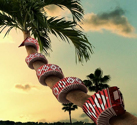
The image above is from a series of images I worked on with photographer Richard Radstone last year. In this particular one of the challenges was to wrap the accordion around the palm tree. That particular task generated my first tutorial on the website, www.psd.tutsplus.com, which can be found here: http://bit.ly/3YEVfT

And of course after wrapping the accordion around the tree it needed to have some shadowing added to make it look like it really belonged there which brings us back to the topic at hand.

Adding the shadows involved creating 2 layers, one for the core shadow, and the other for the cast shadow. In this case I used the Multiply blending mode for both shadows because I like the way the colors of the shadows blend more naturally with the objects in the image.

The way the colors of the shadows blend is very important because shadows do have their own color and this is affected by the color of the ambient light and the color of the object the shadow is landing on. Using the Multiply mode while sampling 'real' shadow colors tends to work pretty well for me.

So for these shadows I sampled a darker color from the palm tree and experimented with a few strokes before deciding on a final color. Remember the darker the color the stronger, darker your shadow will be - but you can easily adjust that with the opacity of your shadow layers.

After settling on the right shadow color I made one layer, called it "Core Shadow", set the blending mode to "Multiply" and then using a smallish brush I painted along the area where the accordion was touching the palm tree. To keep this shadow layer from splashing over onto the sky I clipped it to the palm tree's layer as a clipping group.

After painting the core shadow I then made another layer set to Multiply blending and called it "Cast Shadow". Then I used a much larger brush and painted in the softer cast shadow keeping in mind the shape of the accordion and the direction of the light the accordion would be blocking to cast the shadow.

To get the gradating effect of the cast shadow you can either use a low opacity brush and build up the strokes closer to the object, or use a layer mask, or use the Eraser tool (set to a low opacity) to erase it away until you're happy with the result. I alternately use all 3 methods at times depending on what strikes my fancy that day.

The point here is that the shadows are painted with 2 layers, one for the core and one for the larger cast shadow. By making them independent I can then play with the opacity of each one and use the Move tool to nudge them into the right place if needed.

Using this method I've found it's much easier to create shadows for everything from accordions on trees to vitamin bottles on white. Simple eh?

Friday, March 5, 2010

Steve Austin and Damage


Here's a recent image I worked on with the good folks at BLT & Associates. This version is a poster sized crop of the overall image which was built to also accomodate billboards as well.

Just to give you an idea of the work that went into this image Steve's head was stripped onto another body (there are 2 guys with a build like that? Yikes!). Detail was added to the neck showing more collar bone & muscle definition etc. Since the shot of Steve's head was pretty blurry & low res looking detail had to be added along with lots of sharpening. Thanks to Joseph at BLT for a new sharpening technique involving the HiPass filter and the Linear Light blending mode. Cool new trick!

The background is built from various shots of crowds. Finally the smoke and color treatment was added overall to create the dark moodiness of the overall image.