Here's a quick tip that make a big difference when working in Photoshop: Name Your Layers.
Ok, this sounds really simple, but it also really can make a BIG difference as you work. Ever since Photoshop added Layers it's gotten harder and harder to keep track of what you're doing and even more so what you've done.
What I'm talking about here is situations where you look at your layers palette and see lots of layers named "Layer 1", "Layer 2" etc, etc. When you have to make some adjustment how can you know what "Layer 37" is for and what it does? This gets to be even more important if you're working on a composited image that has bits and pieces from more than one image being combined into a single image.
Simply naming the layers in some way that tells you what the layer is for can help you immensely as you work your way through the project.
When I'm working on an image one of the first things I do is make sure the background layer is named the same thing as the original file. For instance if the file I'm is named "Katie_img_002" I will make that the background layer's name.
This is really easy to do to, all it takes is 3 or 4 steps. (Since I use a Mac I'm gonna give you the Mac shortcuts here - if you're on a PC you'll just have to translate.)
Step 1) Bring up the "Save As" dialogue, (Command + Shift + S).
Step 2) Copy the file's name, (Command + C).
Step 3) Close the dialogue without saving, (Esc).
Step 4) Double-Click on the layer's name in the Layers palette and Paste the copied file name.
With this done no matter what you call the file from now on you'll always know where you started. And if you're copying this layer to another image the file's name is copied with the layer so you'll always know where that piece came from.
Taking the layer naming idea a little farther I also will name layers according to what any filters I've run. For instance if I run a 6 pixel Gaussian Blur on a layer I'll name the layer something like "GBlur 6". Now if for any reason I need to redo this layer I'll always know what I did and what if any change I need to make.
While it doesn't make a tough job easy, it sure helps me keep track of what I'm doing and that always helps!
Friday, January 9, 2009
Wednesday, January 7, 2009
Dustin' & Bustin'
Dustin’ & Bustin’
Every once in a while we come across an image that seems like it’s been through a dust storm. Lots and lots of little specks that all need to be eliminated, one by one by one by… well you get the idea.
Here’s a section of an image that suffers from this very problem. Notice all the whitish specks that cover the face of this watch?

While we can wonder how they got there the question we’re concerned with here is how do we get rid of them?
The first thought that may come to mind is to use Photoshop’s Rubber Stamp tool, also known as the cloning tool. This could work, but keep in mind that this means having to carefully work around all the gradations etc we can see on the face of the watch.
Maybe the Heal Brush could work well here. While I really like the Heal Brush for a lot of tasks, (it can be really great with skin), there are a few things you have to watch out for with it. With an image that has as many spots as this one there can be a little delay each time you click with the brush. It’s not uncommon to get ahead of the tool and have to wait for Photoshop to catch up to our work so we can see how effectively we’ve dealt with the problem. If you’re working with a good sized file, like a couple of hundred Megs, that could be a lot of waiting, and waiting.
In cases like this I’ll go back to an old tried and true technique to make this job as simple and quick as possible: the Dust & Scratches filter.
Found under Photoshop’s Filter>Noise menu the Dust & Scratches filter is basically a variation on the Blur filter. From this screen grab you can see that the filter’s dialogue has settings for both the Radius and the Threshold.

The challenge is to find the balance between the Amount of Blur being applied with the Radius and protecting the smaller details with the Threshold setting. While that can sound a little tricky the way this is used in practice is to find a setting that knocks out most of the dust without blurring out too many little details, (on a duplicate layer of course).
Then the trick is to use a Layer Mask filled with Black to mask out the filtered duplicated layer. Now all you have to do is using the Brush tool paint white in the layer mask wherever you see those nasty little spots and magically they disappear. (Ok not so magically, but it’s more fun to put it that way, eh?)
Since the Brush tool works more quickly than the Heal Brush and the combination of the filter and the layer mask is simpler to use than the Rubber Stamp tool this can be a pretty quick way to knock down the majority of those troublesome spots.
There are a few things to watch out for when using this tool to bust those specks. In this side by side enlargement here you can easily see the small type has been blurred, but what can be just as problematic and more difficult to see are the borders around some of the larger specks.

When viewed closely these borders can be objectionable artifacts that should be avoided. This means that the Dust & Scratches filter usually won’t do the job alone, when you see some artifact like these borders use the Heal Brush or the Rubber Stamp tool instead.
So while it’s definitely not a cure-all solution the Dust & Scratches filter is certainly a very useful one.
Every once in a while we come across an image that seems like it’s been through a dust storm. Lots and lots of little specks that all need to be eliminated, one by one by one by… well you get the idea.
Here’s a section of an image that suffers from this very problem. Notice all the whitish specks that cover the face of this watch?
While we can wonder how they got there the question we’re concerned with here is how do we get rid of them?
The first thought that may come to mind is to use Photoshop’s Rubber Stamp tool, also known as the cloning tool. This could work, but keep in mind that this means having to carefully work around all the gradations etc we can see on the face of the watch.
Maybe the Heal Brush could work well here. While I really like the Heal Brush for a lot of tasks, (it can be really great with skin), there are a few things you have to watch out for with it. With an image that has as many spots as this one there can be a little delay each time you click with the brush. It’s not uncommon to get ahead of the tool and have to wait for Photoshop to catch up to our work so we can see how effectively we’ve dealt with the problem. If you’re working with a good sized file, like a couple of hundred Megs, that could be a lot of waiting, and waiting.
In cases like this I’ll go back to an old tried and true technique to make this job as simple and quick as possible: the Dust & Scratches filter.
Found under Photoshop’s Filter>Noise menu the Dust & Scratches filter is basically a variation on the Blur filter. From this screen grab you can see that the filter’s dialogue has settings for both the Radius and the Threshold.
The challenge is to find the balance between the Amount of Blur being applied with the Radius and protecting the smaller details with the Threshold setting. While that can sound a little tricky the way this is used in practice is to find a setting that knocks out most of the dust without blurring out too many little details, (on a duplicate layer of course).
Then the trick is to use a Layer Mask filled with Black to mask out the filtered duplicated layer. Now all you have to do is using the Brush tool paint white in the layer mask wherever you see those nasty little spots and magically they disappear. (Ok not so magically, but it’s more fun to put it that way, eh?)
Since the Brush tool works more quickly than the Heal Brush and the combination of the filter and the layer mask is simpler to use than the Rubber Stamp tool this can be a pretty quick way to knock down the majority of those troublesome spots.
There are a few things to watch out for when using this tool to bust those specks. In this side by side enlargement here you can easily see the small type has been blurred, but what can be just as problematic and more difficult to see are the borders around some of the larger specks.
When viewed closely these borders can be objectionable artifacts that should be avoided. This means that the Dust & Scratches filter usually won’t do the job alone, when you see some artifact like these borders use the Heal Brush or the Rubber Stamp tool instead.
So while it’s definitely not a cure-all solution the Dust & Scratches filter is certainly a very useful one.
Thursday, November 20, 2008
Bob Stevens and the Smart Smileys
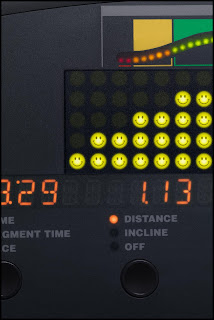
While working on a recent project with Bob Stevens we had an interesting challenge. As part of the Kaiser Health campaign for the ad agency, Campbell Ewald, we needed to create an image that featured the control panel of a cardio workout machine.
In keeping with Kaiser’s Thrive campaign the panel needed to show a series of happy Smiley Faces in place of the lights measuring the intensity of the workout. Now re-working the panel was pretty easy stuff but knowing Bob and the Art Director, Marge Bornais, I knew those 20 or so little happy lights would need to be tweaked and adjusted until they were just right.
Remembering that we had a pretty tight deadline, (what job doesn’t?), I decided it would be a lot easier to get one light looking great than 20. But of course Bob and Marge needed to see all the lights in place before they’d know if they were right or not. Hmmm….
This is where Photoshop’s Smart Objects proved to be the smart answer. You see one feature of the Smart Objects is that you can use it to embed one image into another. And when you change the embedded image it automatically will update in the file you’ve placed it in. What this means is that I could make the Smiley Face light as a separate file, place that in the cardio panel image as a Smart Object and make several copies of this Smart Object to build up the number of lights we needed in the image. So far pretty ordinary, right?
But here’s where the advantage came in, when I needed to change the Smiley Face all I needed to do was double click on one of the copies in the Layers palette, this opened up a separate image that had all the layers of my original Smiley Face. Then after I made the necessary changes to this file and hit “Save” Photoshop automatically updated ALL the copies I had made in the cardio panel.
Huh? All 20 at once? Yup! Just by changing one I could get Photoshop to do all the work of updating all the lights at the same time. Pretty smart, eh?

Wednesday, November 12, 2008
Wick Beavers & the Ascension
Florida photographer, Wick Beaver, had a problem. He was working on creating an updated version of Jesus’ Ascension for one of his clients but was having trouble getting the nail wounds in Jesus’ hands just right.
That was when Wick sent me the image looking to see what solutions I could see for his problem. While I’m not a trained illustrator working as a digital artist for nearly 18 years has taught me to look at images with an illustrator’s approach. And that experience proved to be just what I needed to create the ‘holes’ Wick needed.
Beginning with the idea of the hole itself I added an adjustment layer set to Multiply blending to create the illusion of depth. Then I thought about how the skin would look around the hole and added another adjustment layer to desaturate giving it just the right ‘deadness’. Some illustrated highlights around the edges helped a lot. This was followed by another adjustment layer that was painted in to create the bruises surrounding the wound.
After all that I felt something was still needed. Then I realized, it needed the right texture and shadow detail to really finish pulling off the effect. I grabbed a ‘comp shot’ of some meat and placed that into the holes using a layer mask to control how much detail was apparent in the wound.
Finally I sent a layered file back to Wick with the suggestion that he replace my rough shot of the meat. Rushing out to his compost pile Wick tells me he found some days old chicken breast and some bow tie pasta which he quickly shot and dropped in to finish off the image.
Here’s what Wick had to say about the collaboration:
“I had the great fortune and real honor of having Dennis Dunbar out in LA work the nail holes in the hands of Christ in my Ascension of Christ Ft Lauderdale photo. He immediately grasped the illustrative and kitsch nature of the task and returned me his 15+ layers, masks and adjustments to "get" the rotting, splayed back, bruised nature of the nail holes. Below is a close up of the forward hand. I attach a copy of the final full image as well for a look at the whole image. He left me a single layer he titled "MEAT", for which I shot week old chicken bones and bowtie pasta dug out of our nice compost pile. Yes, gross to the max, but worth the effort in the end!”


Monday, September 29, 2008
Plastic Wrap and Running Shoes

Recently I worked on a project with photographer Bob Stevens, (www.bobstevens.com), that was pretty fun. For me it started with a call from Bob seeking input on how to tackle a particular challenge. You see he was bidding on a job for Kaiser Healthcare and this one image involved shooting a pair of running shoes that were packaged up like a choice steak at the grocery store complete with foam tray and plastic wrap.
The challenge was how could he shoot a few different sets of shoes on the foam tray, get them combined to create a “generic” shoe and then have it all wrapped in plastic wrap.
After thinking about it for a little while I took one of my own shoes and did a couple of quick shots of it with and without plastic wrap and then looked at them carefully to see if I could figure out an approach.
Then it occurred to me, since the wrap is essentially clear it basically showed up in the image as subtle shadows and highlights depending on how it interacted with the light. But each of these qualities also had a certain kind of ‘organic’ look to it so while I could just paint in the shadows and highlights I’d have to be careful to match the way the stretched plastic really caught the light.
So the solution I offered to Bob was simple: Shoot the different shoes without the wrap and then shoot some examples of shoes wrapped in the plastic so we had some good ‘organic’ examples, (otherwise how would we know when it looked “real”). Then all we needed to do was build the generic shoes by compositing bits and pieces and finally I’d illustrate the wrap onto the composited shoes. Easy, eh?
On the day of the shoot Bob had his crew along, with the Art Director, Marge Bornais, and I all meet at the studio. While Bob and his assistants shot the various pairs of shoes I started “comping” together the shots working to build a lo res version of the generic shoes. When every one was confident we had this part covered we moved on to shooting the plastic wrap examples.
To make sure the wrap showed up as well as possible Bob had a pair of black shoes standing in as the hero shoes. Then Bob and his crew shot somewhere between 30 and 40 shots of the plastic wrapped shoes. As they went along they realized that with the reflective nature of the wrap they needed to concentrate on shooting bits at a time. One shot might have a great look over the toes and another have a good highlight over the heel. As they went along the Marge and Bob circled the areas they liked and passed them on to me.
Finally it came to assembling everything together in high resolution for the final ad. First I worked on combining the parts of the shoes to build the generic shoe. When everyone was happy with the new shoes I started working on adding the plastic wrap.
Marge had a great insight oserving that the wrap added some slight darkening effect overall. So first I added a curve that darkened the shoes and the tray just enough to define a shape for the illustrated wrap.
Then I opened up the shots of the plastic wrap and studied them closely. It became pretty apparent that the wrap had a subtle shadow, a more diffused highlight,S and then a sharper, hotter highlight on top. Basically this is the same way you illustrate wrinkles in fabric. I decided to approach it by making a series of layers, one to darken slightly, one to lighten a little and another one for the hotter highlights.
After working that out all I needed to do was to trace the various shapes we liked from the sample shots of wrapped shoes and copy those shapes to the various layers I had made in the hi res file and fill them in with the right color of paint. Sliding the opacity of these layers gave me the control I needed to make sure they had just the right transparent quality.
With Marge and Bob art directing me as I went I then took the shapes I made and gave each one a few tweaks to get them looking good. When that was done I then went around the edge of the foam tray illustrating little wrinkles along the way to complete the illusion.
The final step was to work with Bob and Marge to adjust the overall color and saturation getting the “Feel” Bob was after.
Easy as pie.
Here is a before/after of the base shoes and the final wrapped composite image.


Wednesday, September 24, 2008
Channel Pulling Masks

Sometimes we get lucky. Every now and then there is actually one of those “Quick and Dirty” tricks that actually works and saves us hours of extra work. Depending on the shot “Channel Pulling” is one of those tricks.
Basically the idea here is if one of the channels in the image shows enough contrast between your subject and the background you can make a quick mask based on that channel and save yourself all the work of having to hand paint the mask.
Here’s how a quick run down on how it works. First let’s take an image like this one I got from Jupiter Images. You can see this is just a basic shot of a person against a white background. While this technique can work with more complex images I just wanted to use an easy example to get the idea across.
The first step is to go to the Channels palette and look at each of the channels in the image. This one is an RGB image so we’ll look at the Red, then Green and finally the Blue channels to see which one offers the best contrast between our subject and the background.


Looks like the Blue channel is our best bet so we’ll use that one. Next we’ll click on that channel and pull it down to the folded page icon in the menu at the bottom of the palette. (Ahhh, now you know why it's called "Channel Pulling"!) This makes a copy of the channel called “Blue copy”.
Now click on that channel in the palette menu to select it and see it on the screen.

Looking at this channel we can see that it needs a little work to be useable as a mask. Remember that you need a mask that is mostly black and white with just a little gray in between them to soften the edge and make a good transition between our subject and whatever the new background will be.
Obviously this means we need to add some contrast to the channel so we can push most of the gray values to black while making sure the rest is truly white. My preferred method for adjusting the contrast is with the “Curves” tool. You can get to the Curves adjustment by selecting Image>Adjustments>Curves from the menu, or by using the shortcut Command + M (sorry, I always have trouble remembering the PC equivalent).
Once we bring this up the adjustment itself is pretty easy, just slide the black point (in this window it’s on the lower left) over towards the right until you see the grays start to fill in to black. Then slide the White point (it’s the one on the right) over to the left until the lighter grays turn to white.

It’s good to note that you want some shades of gray around the edges. Since Black and White are the extremes shades of gray give us some feathering around the edge. How much feathering we need all depends on the image itself. As I noted in a previous post the right combination here depends on how crisp or soft the edges in the image itself are. You want your mask to have a similar amount of crispness or softness as your image. Here is a close up view of the bits of gray I’m using to feather the edges of this mask.

Now the next step is to fill in the areas that need to be black but aren’t quite there yet. Depending on what seems easiest I’ll either use a big brush to paint it in, or use the lasso tool to select those parts and then fill them with black. The same thing goes for any areas that really need to be white.
When you’ve completed this you should wind up with something that looks like this:

And now that we have our mask channel made all we need to do is turn it into a layer mask. Doing this is really simple. First make sure your layer is not set as the background layer. (Background layers cannot use layer masks.) If it is all you need to do is double click on it in the Layers palette. With this done now load the channel we just made as a selection. Again I like to do this by command clicking on the channel’s icon in the Channels palette but you can also use Select>Load Selection from the PS menu as well.
With the selection loaded look to see if the crawling ants are running around the outside of the image. Since by default White in the channel indicates the area that will be selected the channel we made will mean the background gets selected instead of the subject. No worries, all you have to do is choose Select> Inverse from the menu (Command + Shift + “i” on a Mac). This flips around the selection and now your subject is selected instead of the background.
Then the last step is to go back to the Layers palette and click on the little “Add layer mask” icon at the bottom of the Layers palette. Here’s a screen shot of it:


Now we have our layer mask and your image should look like this and you’re ready for the next job. (Don’t forget to Save your image.)
Monday, September 8, 2008
Keepin' it Simple with Layers
Maybe this comes under the “Pet Peeve” heading, but as a retoucher I see a lot of Photoshop files with lots of layers that have names like “Layer 1” or “Layer 2” etc. While I know this is Photoshop’s default naming system what happens is pretty quickly you need some sort of guide to tell what layer is doing what, a sure-fire formula for confusion!
So the suggestion I want to make here is take the brief moment it takes to name the layer in some way that helps whoever is working on the image get an idea of what that layer is for.
For instance when I’m working on a beauty shot typically I’ll have a layer where I do the majority of spotting work that’s called “Spotting”, there will also be a layer called “Stray Hairs” etc. This keeps it easy for me to tell what layer to go to when I need to make some further tweaks.
Taking this a step further if you’re combining several images into a composite image it really helps to name the layers with the names of the source images themselves. Since I work on a lot of movie posters it’s common for me to see layers named something like “boy’s head”. This at least tells me what’s on the layer, but gives me no idea which source image the head came from. Have you ever had to search an entire server looking for the correct shot so you can replace it with a cleaner version? Not fun.
But there is help. Here’s a really easy way to copy and paste the name of the source image so the layer is properly named.
Step One: With the source image open use Photoshop’s “Save As” command (Command + Shift + S on a Mac), then copy the name of the file as it shows up in the dialogue (Command + C on a Mac). Then hit the Escape key.
Step Two: Go to the Layers palette and double click on the layer named “Background”, now paste the name you copied in Step One (Command + V on a Mac).
Step Three: Now drag that layer into the composite image. Note that the layer is now named for the source file.
After doing this a few times your fingers will start to automatically go to the right key combinations and you’ll see that with just a few key strokes and a double click or two you’re done and things are organized and easy to figure out.
See, I feel better already. ;-)
Subscribe to:
Posts (Atom)


