Thursday, November 20, 2008

Bob Stevens and the Smart Smileys

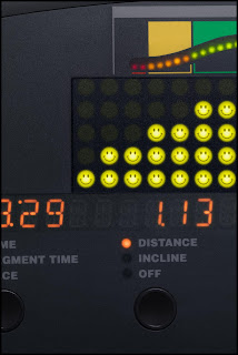
While working on a recent project with Bob Stevens we had an interesting challenge. As part of the Kaiser Health campaign for the ad agency, Campbell Ewald, we needed to create an image that featured the control panel of a cardio workout machine.

In keeping with Kaiser’s Thrive campaign the panel needed to show a series of happy Smiley Faces in place of the lights measuring the intensity of the workout. Now re-working the panel was pretty easy stuff but knowing Bob and the Art Director, Marge Bornais, I knew those 20 or so little happy lights would need to be tweaked and adjusted until they were just right.

Remembering that we had a pretty tight deadline, (what job doesn’t?), I decided it would be a lot easier to get one light looking great than 20. But of course Bob and Marge needed to see all the lights in place before they’d know if they were right or not. Hmmm….

This is where Photoshop’s Smart Objects proved to be the smart answer. You see one feature of the Smart Objects is that you can use it to embed one image into another. And when you change the embedded image it automatically will update in the file you’ve placed it in. What this means is that I could make the Smiley Face light as a separate file, place that in the cardio panel image as a Smart Object and make several copies of this Smart Object to build up the number of lights we needed in the image. So far pretty ordinary, right?

But here’s where the advantage came in, when I needed to change the Smiley Face all I needed to do was double click on one of the copies in the Layers palette, this opened up a separate image that had all the layers of my original Smiley Face. Then after I made the necessary changes to this file and hit “Save” Photoshop automatically updated ALL the copies I had made in the cardio panel.

Huh? All 20 at once? Yup! Just by changing one I could get Photoshop to do all the work of updating all the lights at the same time. Pretty smart, eh?

Wednesday, November 12, 2008

Wick Beavers & the Ascension

Florida photographer, Wick Beaver, had a problem. He was working on creating an updated version of Jesus’ Ascension for one of his clients but was having trouble getting the nail wounds in Jesus’ hands just right.

That was when Wick sent me the image looking to see what solutions I could see for his problem. While I’m not a trained illustrator working as a digital artist for nearly 18 years has taught me to look at images with an illustrator’s approach. And that experience proved to be just what I needed to create the ‘holes’ Wick needed.

Beginning with the idea of the hole itself I added an adjustment layer set to Multiply blending to create the illusion of depth. Then I thought about how the skin would look around the hole and added another adjustment layer to desaturate giving it just the right ‘deadness’. Some illustrated highlights around the edges helped a lot. This was followed by another adjustment layer that was painted in to create the bruises surrounding the wound.

After all that I felt something was still needed. Then I realized, it needed the right texture and shadow detail to really finish pulling off the effect. I grabbed a ‘comp shot’ of some meat and placed that into the holes using a layer mask to control how much detail was apparent in the wound.

Finally I sent a layered file back to Wick with the suggestion that he replace my rough shot of the meat. Rushing out to his compost pile Wick tells me he found some days old chicken breast and some bow tie pasta which he quickly shot and dropped in to finish off the image.

Here’s what Wick had to say about the collaboration:
“I had the great fortune and real honor of having Dennis Dunbar out in LA work the nail holes in the hands of Christ in my Ascension of Christ Ft Lauderdale photo. He immediately grasped the illustrative and kitsch nature of the task and returned me his 15+ layers, masks and adjustments to "get" the rotting, splayed back, bruised nature of the nail holes. Below is a close up of the forward hand. I attach a copy of the final full image as well for a look at the whole image. He left me a single layer he titled "MEAT", for which I shot week old chicken bones and bowtie pasta dug out of our nice compost pile. Yes, gross to the max, but worth the effort in the end!”


Monday, September 29, 2008

Plastic Wrap and Running Shoes


Recently I worked on a project with photographer Bob Stevens, (www.bobstevens.com), that was pretty fun. For me it started with a call from Bob seeking input on how to tackle a particular challenge. You see he was bidding on a job for Kaiser Healthcare and this one image involved shooting a pair of running shoes that were packaged up like a choice steak at the grocery store complete with foam tray and plastic wrap.

The challenge was how could he shoot a few different sets of shoes on the foam tray, get them combined to create a “generic” shoe and then have it all wrapped in plastic wrap.

After thinking about it for a little while I took one of my own shoes and did a couple of quick shots of it with and without plastic wrap and then looked at them carefully to see if I could figure out an approach.

Then it occurred to me, since the wrap is essentially clear it basically showed up in the image as subtle shadows and highlights depending on how it interacted with the light. But each of these qualities also had a certain kind of ‘organic’ look to it so while I could just paint in the shadows and highlights I’d have to be careful to match the way the stretched plastic really caught the light.

So the solution I offered to Bob was simple: Shoot the different shoes without the wrap and then shoot some examples of shoes wrapped in the plastic so we had some good ‘organic’ examples, (otherwise how would we know when it looked “real”). Then all we needed to do was build the generic shoes by compositing bits and pieces and finally I’d illustrate the wrap onto the composited shoes. Easy, eh?

On the day of the shoot Bob had his crew along, with the Art Director, Marge Bornais, and I all meet at the studio. While Bob and his assistants shot the various pairs of shoes I started “comping” together the shots working to build a lo res version of the generic shoes. When every one was confident we had this part covered we moved on to shooting the plastic wrap examples.

To make sure the wrap showed up as well as possible Bob had a pair of black shoes standing in as the hero shoes. Then Bob and his crew shot somewhere between 30 and 40 shots of the plastic wrapped shoes. As they went along they realized that with the reflective nature of the wrap they needed to concentrate on shooting bits at a time. One shot might have a great look over the toes and another have a good highlight over the heel. As they went along the Marge and Bob circled the areas they liked and passed them on to me.

Finally it came to assembling everything together in high resolution for the final ad. First I worked on combining the parts of the shoes to build the generic shoe. When everyone was happy with the new shoes I started working on adding the plastic wrap.

Marge had a great insight oserving that the wrap added some slight darkening effect overall. So first I added a curve that darkened the shoes and the tray just enough to define a shape for the illustrated wrap.

Then I opened up the shots of the plastic wrap and studied them closely. It became pretty apparent that the wrap had a subtle shadow, a more diffused highlight,S and then a sharper, hotter highlight on top. Basically this is the same way you illustrate wrinkles in fabric. I decided to approach it by making a series of layers, one to darken slightly, one to lighten a little and another one for the hotter highlights.

After working that out all I needed to do was to trace the various shapes we liked from the sample shots of wrapped shoes and copy those shapes to the various layers I had made in the hi res file and fill them in with the right color of paint. Sliding the opacity of these layers gave me the control I needed to make sure they had just the right transparent quality.

With Marge and Bob art directing me as I went I then took the shapes I made and gave each one a few tweaks to get them looking good. When that was done I then went around the edge of the foam tray illustrating little wrinkles along the way to complete the illusion.

The final step was to work with Bob and Marge to adjust the overall color and saturation getting the “Feel” Bob was after.

Easy as pie.

Here is a before/after of the base shoes and the final wrapped composite image.


Wednesday, September 24, 2008

Channel Pulling Masks


Sometimes we get lucky. Every now and then there is actually one of those “Quick and Dirty” tricks that actually works and saves us hours of extra work. Depending on the shot “Channel Pulling” is one of those tricks.

Basically the idea here is if one of the channels in the image shows enough contrast between your subject and the background you can make a quick mask based on that channel and save yourself all the work of having to hand paint the mask.

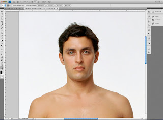
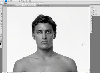
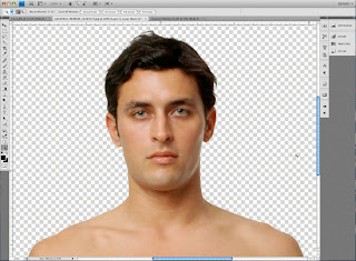
Here’s how a quick run down on how it works. First let’s take an image like this one I got from Jupiter Images. You can see this is just a basic shot of a person against a white background. While this technique can work with more complex images I just wanted to use an easy example to get the idea across.

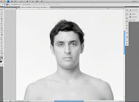
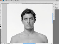
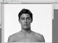
The first step is to go to the Channels palette and look at each of the channels in the image. This one is an RGB image so we’ll look at the Red, then Green and finally the Blue channels to see which one offers the best contrast between our subject and the background.


Looks like the Blue channel is our best bet so we’ll use that one. Next we’ll click on that channel and pull it down to the folded page icon in the menu at the bottom of the palette. (Ahhh, now you know why it's called "Channel Pulling"!) This makes a copy of the channel called “Blue copy”.

Now click on that channel in the palette menu to select it and see it on the screen.


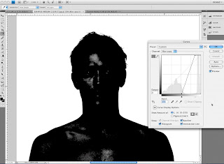
Looking at this channel we can see that it needs a little work to be useable as a mask. Remember that you need a mask that is mostly black and white with just a little gray in between them to soften the edge and make a good transition between our subject and whatever the new background will be.

Obviously this means we need to add some contrast to the channel so we can push most of the gray values to black while making sure the rest is truly white. My preferred method for adjusting the contrast is with the “Curves” tool. You can get to the Curves adjustment by selecting Image>Adjustments>Curves from the menu, or by using the shortcut Command + M (sorry, I always have trouble remembering the PC equivalent).

Once we bring this up the adjustment itself is pretty easy, just slide the black point (in this window it’s on the lower left) over towards the right until you see the grays start to fill in to black. Then slide the White point (it’s the one on the right) over to the left until the lighter grays turn to white.


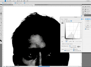
It’s good to note that you want some shades of gray around the edges. Since Black and White are the extremes shades of gray give us some feathering around the edge. How much feathering we need all depends on the image itself. As I noted in a previous post the right combination here depends on how crisp or soft the edges in the image itself are. You want your mask to have a similar amount of crispness or softness as your image. Here is a close up view of the bits of gray I’m using to feather the edges of this mask.


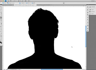
Now the next step is to fill in the areas that need to be black but aren’t quite there yet. Depending on what seems easiest I’ll either use a big brush to paint it in, or use the lasso tool to select those parts and then fill them with black. The same thing goes for any areas that really need to be white.


When you’ve completed this you should wind up with something that looks like this:


And now that we have our mask channel made all we need to do is turn it into a layer mask. Doing this is really simple. First make sure your layer is not set as the background layer. (Background layers cannot use layer masks.) If it is all you need to do is double click on it in the Layers palette. With this done now load the channel we just made as a selection. Again I like to do this by command clicking on the channel’s icon in the Channels palette but you can also use Select>Load Selection from the PS menu as well.

With the selection loaded look to see if the crawling ants are running around the outside of the image. Since by default White in the channel indicates the area that will be selected the channel we made will mean the background gets selected instead of the subject. No worries, all you have to do is choose Select> Inverse from the menu (Command + Shift + “i” on a Mac). This flips around the selection and now your subject is selected instead of the background.

Then the last step is to go back to the Layers palette and click on the little “Add layer mask” icon at the bottom of the Layers palette. Here’s a screen shot of it:


Now we have our layer mask and your image should look like this and you’re ready for the next job. (Don’t forget to Save your image.)

Monday, September 8, 2008

Keepin' it Simple with Layers

Maybe this comes under the “Pet Peeve” heading, but as a retoucher I see a lot of Photoshop files with lots of layers that have names like “Layer 1” or “Layer 2” etc. While I know this is Photoshop’s default naming system what happens is pretty quickly you need some sort of guide to tell what layer is doing what, a sure-fire formula for confusion!

So the suggestion I want to make here is take the brief moment it takes to name the layer in some way that helps whoever is working on the image get an idea of what that layer is for.

For instance when I’m working on a beauty shot typically I’ll have a layer where I do the majority of spotting work that’s called “Spotting”, there will also be a layer called “Stray Hairs” etc. This keeps it easy for me to tell what layer to go to when I need to make some further tweaks.

Taking this a step further if you’re combining several images into a composite image it really helps to name the layers with the names of the source images themselves. Since I work on a lot of movie posters it’s common for me to see layers named something like “boy’s head”. This at least tells me what’s on the layer, but gives me no idea which source image the head came from. Have you ever had to search an entire server looking for the correct shot so you can replace it with a cleaner version? Not fun.

But there is help. Here’s a really easy way to copy and paste the name of the source image so the layer is properly named.

Step One: With the source image open use Photoshop’s “Save As” command (Command + Shift + S on a Mac), then copy the name of the file as it shows up in the dialogue (Command + C on a Mac). Then hit the Escape key.

Step Two: Go to the Layers palette and double click on the layer named “Background”, now paste the name you copied in Step One (Command + V on a Mac).

Step Three: Now drag that layer into the composite image. Note that the layer is now named for the source file.

After doing this a few times your fingers will start to automatically go to the right key combinations and you’ll see that with just a few key strokes and a double click or two you’re done and things are organized and easy to figure out.

See, I feel better already. ;-)

Saturday, August 16, 2008

Divide & Conquer: Color to B&W


Black and White imagery has had a long tradition in the world of photography. And in this digital age Photoshop goes a long way to honor that tradition giving us many different ways to convert our Color images to Black and White with more control and finesse than ever before.

What I’d like to talk about here is how to make use of some of that control to easily get results that couldn’t be achieved before without a lot of effort. Suppose you have an image like this one I took at Lake Powell a couple of years ago.

Having grown up loving the dramatic skies in Ansel Adams’ images. When I looked at this image and thought of doing a B&W version I wanted to get close to that kind of drama in the skies. But as I worked on it with Photoshop CS3’s B&W adjustment layer I realized that I wanted to also bring out the detail and contrast in the cliffs. The adjustments that gave me a cool looking sky just didn’t seem to do what I wanted in the cliffs.

Here is a screen shot showing the image adjusted for the sky along with the settings I used to get that.


And when I worked to get the detail and tonality in the cliffs the sky just seemed to miss out on the drama. Here is a screen shot showing the image adjusted for the cliffs, again with the settings.


Luckily Photoshop gives us an easy way to have the best of both adjustments. The secret is to use both adjustment layers combined with layer masks that makes sure they’re only affecting the areas we want affected. To do this all I did was start out with one adjustment, in this case the one for the cliffs, and then by painting black in the layer mask I kept this adjustment from affecting the sky.

Here is a screen shot with the layer mask shown as a Red overlay:


Then all I had to do was copy the mask from the Cliffs adjustment layer to my Sky adjustment layer and invert the values so I had the opposite part of the image covered. That looked like this:


Finally all I had to do was give a quick look over the image to make sure none of the original color was showing up in between the two adjustments and voila I had this as the finished image:

Wednesday, July 30, 2008

B&W APA Seminar on Aug. 9th

I'll be teaching another seminar for the Los Angeles chapter of the APA on August 9th with some of the folks from Bowhaus. Should be an interesting day.

APA/LA Digital Workshop: From Color to Black and White
Saturday August 9th, 2008
9am - 1pm
3221 Hutchinson Ave, LA CA 90034

Sign Up Today at www.apa-la.org
LIMITED SPACES FOR THIS EVENT PRE-REGISTRATION IS STRONGLY RECOMMENDED

Join us Saturday, August 9th as we present our own Dennis Dunbar and
Bowhaus' Antonis Ricos in the latest of our series of digital seminars.
They'll be taking their audience on an exploration of the Black and White
digital world.

Dennis will start things off by delving into the process of converting Color
Images to Black and White. He'll discuss what happens when you hit the
magical B&W button in Photoshop and show you how to gain control of the
process so you can fine tune the conversion to get the results you're after.
Then he'll show you how you can "Mix and Match" conversion methods to bring
out the right tonality and detail in specific areas of your image.

Then Bowhaus' Antonis Ricoss will take over the session and show you how to
get "Fine Art" Black and White prints from your images. He'll show you how
to create Digital B&W inkjet prints with rich blacks, luminous highlights
and ultra-smooth gradations. These guys really have mastered this art and
you'll see why acclaimed fine art photographers and galleries are now
choosing BowHaus to produce their Master and Exhibition prints. He'll also
show you Bowhaus' IJC/OPM software as well as their new "True Black and
White" printmaking software that you can use to create your own stunning
Digital B&W inkjet prints.

Come join us as this seminar promises to be informative and intriguing and
will help you gain the knowledge you need to move seamlessly between the
World of Color to the World of B&W.

Pre-Registration
$35 APA/LA members
$45 ASMP, LADig, Student members
$55 non-members

Day of:
$45 APA/LA members
$55 ASMP, LADig, Student members
$65 non-members

Brought to you in part by:
Bowhaus www.bowhaus.com

Tuesday, July 29, 2008

Good Mask - Bad Mask

One of the more frequent questions I get asked is about masking. Almost every Photoshop user has used masks at one time or another to control how one image blends with another to limit some effect to certain areas of the image. Safe to say they're used a lot. But the question that comes up is "What makes a Good Mask?"

Of course the quick answer is "It all depends on what you're trying to do." What that really means is different tasks require different qualities of masks. For instance if you just want to 'nudge' the color of one area a little bit you may get away with a softer mask that's not too exact. But if you're going to strip in a new background behind a shot of a model you're probably going to have to be a good deal more careful with your mask.

In this case the answer to our question "What makes a Good Mask?" is primarily about 'Edge Quality'. With a mask the hardness or softness of the edge is what makes for a seamless, natural looking blend or something that looks like you used a pair of scissors on. This is what we mean when we talk about 'Edge Quality'.

To get a bit deeper with this idea take a close look at the image of your model paying careful attention to the edges that naturally occur inside the image. The edge of your mask should look pretty close to how these natural edges look. Any harder than that and the image will look 'Cut Out'. Any softer and it may look 'Mushy'. (Great technical terms, eh?)

When I'm working on a mask I usually like to use a brush to paint around the edges of the part I'm masking. And while painting this edge I look to use a brush with the right size/hardness combination that looks as hard or as soft as the edge of whatever it is I'm masking. Sometimes this means I need to change the brush as I go along because maybe the depth of field means one part looks sharper than another. After I've painted this 'border' I'll then use the lasso tool and
make a series of selections based on tracing more or less along the center of the border that are then filled to make the mask.

Here is an example.

With this image the red outline you see is the border I painted, and as usual the edge of this bear varies according to the depth of field so I had to change the brush along the way as I
painted.


Here is the image with a black line showing the selection I made with the Lasso Tool.


And here is the image with the mask filled using that selection.


Now let's check the mask to make sure it's solid White and solid Black where it needs to be.


Finally here is the image with a new background.

Of course since I used the mask as a "Layer Mask" all I've done is hide the original background so the new one can show through. This means I can easily fine tune this mask to make sure everything looks just right.

Thursday, July 3, 2008

Adding Glows to Hair

Lately a good deal of the work I've been doing has been with photographers who shoot high end beauty shots. Part of this work usually involves adding "a nice glow" to the hair and skin of the model. While there are several ways to do this I thought I'd share here a simple technique for adding a soft, luminous glow to the hair.

To get this effect we're going to use one of Photoshop's "Layer Blending Modes". As you're probably aware there are many blending modes we can use in Photoshop. These break down to variations on a few themes. There are blending modes that affect Contrast and Saturation, modes that darken the image and modes that lighten the image as well as a few other ones.  

Now one thing that users frequently forget is that an Adjustment Layer set to a particular blending mode even without any adjustment made to the settings of the layer itself will give you the same effect as if you had copied the image itself as a layer and set it to that same blending mode. 

The cool thing about using an Adjustment Layer (I like Curves myself) is that it adds almost nothing to the size of your file, which can be an important consideration if you're working on big files. The other cool thing is that while you don't need to play with the adjustments in the layer you can to tweak the effect you're getting. 

The mode we'll use here is the "Screen" mode. This blending mode will lighten an image based on how light the tones are in the layer. So White will have the strongest effect and Black will have the weakest effect. And all you need to do is add a Curves adjustment layer set to "Screen" blending and then make sure the mask for this layer is filled with black (this hides the effect of the layer). 

Now just look at your image and picture where you want the Glow to appear. Then  take the Brush tool and paint White in the Layer Mask wherever you want this effect to show. To really get this right you need to think a bit like an illustrator, but armed with the knowledge that you can always undo the effect by painting Black in the Layer Mask you're free to play and experiment until you're happy with the effect. If it's too strong you can also turn down the opacity of the layer to back off. 

So try it on one of your own images and see how it works. Play a bit and I bet you'll like it.

Tuesday, July 1, 2008

Communicating Color Effectively

Remember the story about the 3 Blind Men who are shown an animal and asked to describe it? Of course, being blind, they use their hands to feel parts of the animal and then describe what they think the animal is. The first one goes to the front and reaches out to the animal he says, “This is long, thick and strong like a python snake!” The second moves forward, feels the side of the animal and says. “This is tall and wide, like a wall!” Then the third goes to the back and says, “No, this is long and thin, like a rope!”

Meanwhile what the men don’t realize is that they are meeting an elephant, not a python, wall or rope. Communicating the proper appearance of digital images can be a lot like this. When there is no tangible image what we see depends on how our systems are setup. Without following proper color management procedures, or paying close attention to what the others in the workflow are doing we become like the blind men, describing something based on just a small part of the whole picture.

Fortunately the answer has gotten a lot easier in the last several years. Advances in software and hardware has made trusting what you see on your screen possible. By calibrating and profiling your displays using any one of the reputable packages available these days we can know that we are looking at something pretty close to “The Truth”.

If it stopped there life would be easy. But, of course, life is not so easy. In the vast majority of times there are others in the chain we need to deal with. Making sure your image is treated properly and winds up looking like you planned is one of the big challenges in the modern digital workflow.

Here communication is key. Knowing who to talk with, and what questions to ask can be critical to the process. How do you know what the client needs? And how can you get it to them in a way that makes getting it right easy? This is where groups such as UPDIG and DISC come in.

UPDIG, (the Universal Photographic Digital Imaging Guidelines, www.updig.org), is an industry-wide group created by a consortium of photographer’s groups such as APA, ASMP.EP.PPA and many more throughout the world that is focused on determining the requirements for digital images in the various parts of our industry. The folks working on UPDIG have created many resources for photographers and clients including guidelines and “Best Practices” documents for both image creators and those receiving digital images.

This work, begun at the 2004 PPE show, is on-going and continues to grow in both scope and reach. Go to their website, www.updig.org, to learn more about the group and to download the guides and best practices, then put them into practice and share them with your clients, and anyone receiving your digital images. Remember, communication is key.

Monday, June 30, 2008

Playin' with Textures


After years of working on movie poster images I've come to really love some of the rich textural treatments the designers I've worked with create. So whenever I am out shooting images for myself I inevitably look for things I can use as textures with other images I may play with later on. I've built up a library with lots of shots of wood, rust, water, greenery, basically anything that looks interesting.

There are lots of ways to use these textures in combination with other images to get some cool looking results. One of the most common ways is to make use of the Overlay Blending Mode. This blending mode basically takes what is in the layer and uses it to increase the contrast and saturation of the layers below. Anything that is neutral gray has no effect and the farther away you get from neutral gray the stronger of an effect it has. We used this blending mode as a way of burning and dodging an image in the previous post. But here we'll look at how it and other blending modes can be used to get some interesting results.

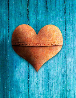
Above is an image I created as an example for a seminar I taught on Channels and Blending Modes. What I want to discuss here is how I created the Blue Wood background for the rusty heart to sit on. 

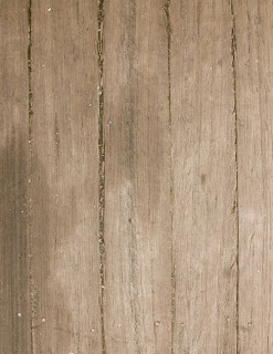
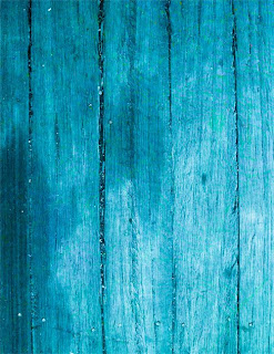
To begin with I dipped into my library of textures and found this shot of some wood that I took on a dock in New York a few years ago. 


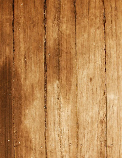
As you can see it's sort of interesting, but a bit flat and it lacks the "punch" I wanted the background to have. After doing a little contrast enhancement I added a Curves Adjustment Layer set to "Overlay" Blending. (Yes, you can use blending modes with Adjustment Layers. In fact it doing this gives you exactly the same result as adding a copy of the image and setting that to the same blending mode - but it adds almost nothing to your file size.) So after this step this is what the wood background looked like.


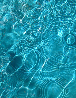
OK, now we're getting something interesting. This has much more drama to it and will work a lot better with the Rusty Heart. But a warm background and a warm foreground image won't really work well together here so I needed to shift the color to make the heart "pop" more. That's when I looked for another texture to add to the wood. Again a trip to my textures library led me to this shot of some water in a fountain that I took several years ago while taking my oldest daughter to Summer Camp.


The blue of this water looked like it would work well as a way to set off the heart I had made and so I placed a copy of the water over the adjusted wood image and tried out different blending modes. In this case I really just wanted to use the color of the water to make the wood pick up the blues in the image. I also liked the variety in the color that the highlights from the ripples added and wanted to use those as well. 

Of all the blending modes Photoshop gives us there are two that primarily affect color: "Color" and "Hue". The main difference here is that the "Color" mode will affect the saturation of the layers below while the "Hue" mode won't. In playing with the two modes I chose Hue and got this result:


Now that's more like it! By combining a couple of images as textures and playing with their blending modes I went from the drab looking wood to this much more interesting wood that worked much better as a background for the rusty heart. Here is a larger example of what the final image looked like.


Now the bigger question is what textures do you have to play with?

Saturday, June 28, 2008

Burnin' & Dodgin' on a layer

One of the most useful techniques in working on an image is to do selective burning and dodging, that is carefully darkening and lightening parts of an image to define edges, create a sense of detail or even to add "shape" to a part of the image.

As a digital artist I've seen many different ways of doing this, and most work pretty well. The most common way is to make a copy of the layer and just use the burn and dodge tool in Photoshop. While this can be effective I personally find it limiting and inefficient.

It's limiting because it's hard to adjust what you've done after the fact, and inefficient because every time you need to copy a layer you're making your file bigger and forcing Photoshop and the computer to do more work.

Here's a simpler way: Create a new layer, set the blending mode to "Overlay" and then using a brush paint White to lighten and Black to darken. When I'm working with this technique I use a low opacity on the brush so I can more easily control how much I'm lightening or darkening the image. Also don't fill the layer with Neutral Gray, it's really unnecessary and just makes the layer bigger.

Overlay is one of three blending modes that affects the contrast of an image depending on how much lighter or darker than neutral gray the values are. White and Black will produce the strongest effect and shades of light or dark gray produce gentler effects.

One thing to look out for when working this way is that sometimes the colors in the image may gain an unnatural looking saturation when you use a strong effect. For this reason I'll frequently use one Overlay layer to darken and another to Lighten. Doing it this way makes it easier for me to change what I've done. For instance if I like the way the Lightening worked but wanted to back off on the Darkening I can just lower the opacity of the Darkening Layer leaving the Lightening Layer alone.

It takes some experimentation, but as with anything the more you play with it the better your control will be.

Wednesday, June 25, 2008

Starting Out

As a digital artist I tend to look at images trying to find easier ways to get certain looks or effects. When a group of photographer friends were discussing various in camera techniques they used one of them shared a self portrait he had done where he really liked the pronounced blue tone he had achieved.

I liked the look, but thought his process didn't give him much control so I opened up a shot he had done of me and started to play with various ways to get a similar effect. Turned out it was pretty easy.

Here is the shot I chose to play with:
And here is the final Blue version:


To get this effect all I did was play with Photoshop's Curves Adjustment Layer. If you set the blending mode to "Color" and then push and pull the curves about you'll find that the only thing you're affecting is the color and saturation of the image. Pulling down on the Red Curve will take Red out of the image, but won't make it any darker or affect the contrast either.

So for this image I created a Curves Adjustment Layer, set the blending to "Color" and then went to the Blue Curve and pulled the bottom point all the way to the top so it was a flat line adding all the blue it could to the image.

Then to get just the shade of Blue I wanted I took some Red and some Green out as well. Finally I toned down the saturation by going to the RGB Composite Curve and pulled the white point (the one in the upper right corner) straight down until I liked the saturation.

Here is a screen grab of what the adjustments in Photoshop looked like:It's great that Photoshop now lets you see what's happening in all the channels at once. Here you can see that I took almost all of the Red out of the image and most of the Green as well. All in all it took about 5 or 10 minutes of playing to create this look. The thing I like best about working in digital imaging is that it's so easy to play with something until you get what you want. The more you do it the easier it gets to see how to get there.

Try playing with this idea on some of your own images and see what "Looks" you can create.