Tuesday, November 10, 2009

Pserpective Grids in Photoshop

Illustrators often will draw out perspective lines when beginning a complex illustration to help them keep everything looking just right.

The old way involves defining the vanishing point and then drawing a series of lines all intersecting and passing through that vanishing point. While effective this could be somewhat of a time consuming process.

Then while working with one of my students I recently discovered this great little trick for using Photoshop's Vanishing Point filter to render perspective lines. Now whenever I need them Perspective Lines are just a few clicks away.

To show you how easy it is take a look at this image of New York's Public Library:
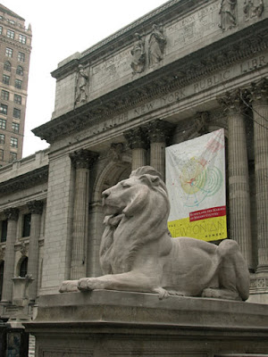
The perspective on this shot is pretty exaggerated, but that just helps illustrate my point. If I wanted to add something to the front of the library, or maybe add another building next to it it would be a big help to have some guides that showed me how the vanishing point lines lay in proper perspective.

Now I know one of the common uses for the Vanishing Point filter is to be able to clone and paste things in while keeping the proper perspective. But using the Vanishing Point filter only works well if the object I'm pasting in is "straight" to begin with.

Suppose the new building I want to add already has some perspective happening in the shot? This is where some guides showing me the correct perspective could be really helpful. And luckily that's something the Vanishing Point filter can easily do.

By just following a few easy steps we can have those guides on a separate filter ready to help us keep everything looking right.

Step 1) Make a new layer so you have a place for the Perspective Grid to go. (Hint: give this layer a name that makes it easy to remember what it is.)

Step 2) Make this new layer the active layer by clicking on it in the Layers palette. Then go to Filter>Vanishing Point to bring up the Vanishing Point window.

Step 3) Using the Create Plane tool define a plane that follows the plane you want the perspective lines to follow. (I used the corners of the banner as an easy way to define the plane for the front of the library.)

Step 4) Once your plane has been defined expand it out to fill the necessary area by clicking on the handles in the middle of each side of your plane and dragging them out until they cover the area you need.

Step 5) Now here is the magic part: Looking at the menu bar in the Vanishing Point filter you'll notice a small icon that looks like 3 short horizontal lines with a tine triangle just to the left of those lines. Clicking on this brings up a submenu like this:
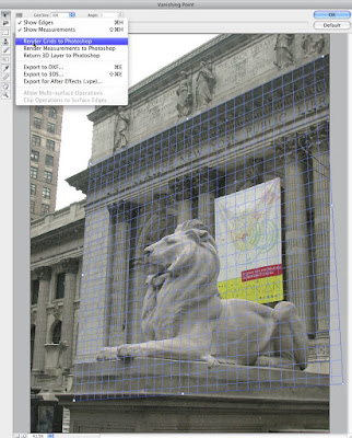


Here is a close-up of that submenu:
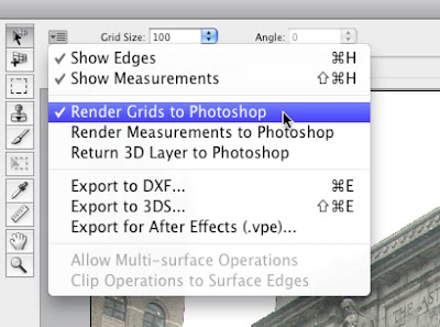


See where I've highlighted the "Render Grids to Photoshop" option? If you choose this and then apply the filter by clicking on "OK" in the upper right corner of the filter window Photoshop will now render out those grids to that new layer you made just before bringing up the filter. You should get something looking like this:
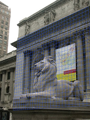


And now all you need to do when adding that new building is to make sure the lines of the new building follow the lines in the grid and you'll have everything following the same perspective.

Cool, eh?

Monday, October 19, 2009

Cafe: The Land of Flavors

Earlier this year Dennis worked on a campaign with photographer Richard Radstone featuring surrealistic scenes representing different regions in Colombia. This image highlights the coffee growing region that is known the world over for the great flavor of the coffee it produces.


AC-Cafe

In building this image Dennis began with a sky he had shot while on a trip to Lake Powell. Then he added in stock elements of the hills covered in coffee trees being careful to blend in the edges around the trees. Next he created the foreground by combining Richard's shot of a grassy meadow with the coffee cups and the model shot in the studio. Finally the rainbow steam was composed by adding shots of smoke with a rainbow gradient to get the colorful effect the client wanted. After retouching the model and removing a few extra wrinkles from his shirt the image was ready to go.

Here is a before and after image showing some of the elements used in creating the final image.

RR-Ad-Cafe-Before-Aftr-sidebyside

Thursday, August 27, 2009

Quick Tip: Checking your Masks

Of all the skills needed in doing High End Retouching, (or "Finishing" as they call it in the movie poster biz), masking is among the most basic and essential. When combining several images together a mask is used to determine what parts of the image are kept and which are not seen so the quality of your mask will have a big effect on the final image.

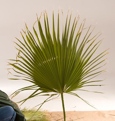
Think of it this way if you were going to add this palm frond to an image you'd want to make sure only the frond itself showed so you wouldn't have any of the background or the guy messing up the image.


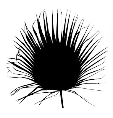
One quick way to make a mask for something like this is to copy one of the channels from the image and manipulate the contrast in the copied channel to make sure the background is separated from the frond.

A quick look at the Red, Green and Blue channels told me the Blue channel would make an easy starting point and so after copying that channel and Curves, (my favorite tool for this), I pushed the Black and White points over to get this:

Pretty easy, eh?

Before moving ahead, in order to work correctly there are a couple of things we need the mask to do properly:

1) The edges have to have the right amount of contrast to them to make it look right. If the edges are too hard it'll look cutout, and if they are too soft the image will look mushy and out of place.

2) The parts of the mask that are supposesd to be White need to be completely White and not have any 'dirty' specks. And the Black areas need to be completely Black and not have any 'holes'.

If the mask has parts that are not clean you'll see holes in the palm that don't belong there, or you'll see flecks of the background showing up in unexpected places. Hunting these mistakes down can be a time consuming hassle.

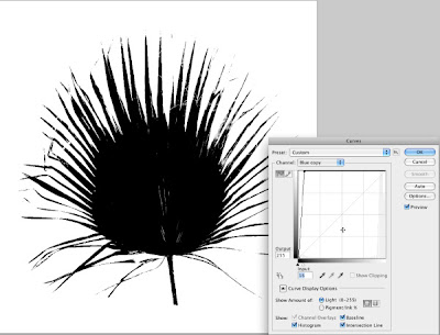
So here's the long promised Tip: Use the Curves tool to double check the White and Black parts of the mask. Basically the idea is to make the mask as you think it needs to be, with the edges adjusted to the right hardness, then once again open up the Curves tool and push the White and Black points way over like these examples below:


In the top example I temporarily moved the Black point way over to the left so I could check to see if there was any 'dirt' in the Whites of the mask. And sure enough there was quite a bit on the left side of the image.

And in the lower example I moved the White point way over to the right to check for any 'holes' in the black areas. Once again there was some in the middle part of the frond.

Note: An important thing to remember is that you're only using this method to check your masks, be careful NOT TO APPLY these extreme Curves to your mask. You're only looking for any problems that will need to be fixed.

Now that I knew where the problem areas were I could solve them using any of several ways, usually some combination of pushing the White and Black points over just enough along with some painting using the Brush tool to finish up the job.

The key is by temporarily exaggerating the Whites and Blacks of the mask you can see where the problems are and solve them before they become something more bothersome like unexplained specks on your beautiful composited images.

Until my next post Happy Masking!

Monday, August 3, 2009

The Magical Land of Bucaramanga

Recently Dennis created a series of images with photographer Richard Radstone featuring surrealistic scenes representing different regions in Colombia. This image spotlights the Magical Land of Bucaramanga where Lollipop Trees meet up with friendly Alien Moss Balls while passing bicyclists stop to read their favorite science fiction stories.


The work on this image began with Pre-Production meetings between Richard and Dennis where they planned out a strategy that would allow them to work efficiently and quickly. Working from the client's sketches Richard shot various elements to be used for the background and foreground pieces. Next Dennis and Richard moved into the studio where Dennis worked on creating low res comps stopping to drop in a few quick frames as Richard shot the model to be sure the perspectives all lined up properly. After a week of shooting various models and props for the complete series of 30 ads Dennis and Richard then moved their operations back to Richard's office where they proceeded to work closely together creating the final ads.

For this image, representing the region of Bucaramanga, Dennis began by extending the grassy field Richard had shot for the foreground. Next they experimented with various skies until Dennis achieved the final effect by layering multiple sky shots together to build up the density and tonal range the client wanted for this image. Various flocks of birds were then stripped out and combined with the sky. Then he moved on to rendering the triangle frees and moss balls from elements Richard had shot in the studio. Since this region was known for it's moss covered trees a search through various stock libraries finally resulted in an image the client liked which was then carefully masked out and dropped in place.

The bench and lamps were added in to give the image more of a park-like atmosphere, the bicycle was placed in and changed from red to black. Next Dennis took a shot of gravel from his own library of textures and used it to create the path that runs through the background. Finally lighting effects including highlights and shadows were painted in to give the image a more mysterious feel.

Here is a before and after image showing some of the elements used in creating the final image.


Tuesday, July 7, 2009

Amazing PDF Tricks

Just the other day a client was having problems converting a PDF file to a JPEG. After seeing the results she was getting and helping her solve the problem I thought this could be a good topic for a blog post/tip.

PDF files have many strengths, and can be amazingly flexible. Several years ago I discovered two of my favorite uses for these files while working on various projects that had certain challenges. The first was when I was working on an ad campaign for a cruise ship line. In that job they had created a new paint scheme but did not have any photos of the ships with the new paint. So they sent me some older photos of the ships and a PDF showing the new paint scheme. As I was trying to figure out how to map the various swirls onto the older photos I discovered that when I opened the PDF file in Adobe Illustrator all the paths and fills were there making it easy for me to copy them into Photoshop where I warped them into place. Very Cool!

Here's a before/after from one of the images in that campaign.


The next favorite use came up when I was working at a smaller ad agency as their production manager/retoucher. As with many agencies it's hard for them to stay on top of every new version of the various programs they use. For instance it could take several months after Adobe would come out with a new version of Photoshop or Illustrator for them to update everyone's systems with the new software. (One of the things I loved about being the Production Manager/Retoucher was that I was usually first in line for the new stuff.) So on occasion we'd get a file from a client that was saved in a newer version than we were running at the time. With something like a logo or template set up in Illustrator this could be a big problem.

It was then that I discovered my second favorite trick with PDFs: Illustrator files can be opened in Adobe's Acrobat and saved as a PDF! By opening the newer Illustrator file in Adobe Acrobat and saving it as a PDF I could then use trick number 1 and open the PDF in my older version of Illustrator without problem! Now we would not have to call the client and make them think we were too behind the times to do the work they needed. Again Very Cool!

With all these cool uses in mind for PDF files the point I really wanted to talk about here was how to convert PDFs to JPEG files so they can be used in even more ways. Before we get into this it's important to remember there are basically two kinds of files used these days: Vector files and Bitmap files. In short Vector files are based on formulas etc that tell the computer exactly how to "draw" the elements in the file. And Bitmap files are ones that are based on pixels, all that the computer knows about these files are what color pixel goes next to that color pixel. Illustrator files and live type are good examples of Vector files while almost any Photoshop file is a good example of a Bitmap tile.

PDF files can be a mix of these two file types. And because of this they don't really have a set resolution. This is part of what makes them so flexible but for some uses such as on a web page it can be better to save them as a JPEG file giving you a smaller file that will load faster. The challenge lies in how you do the conversion from PDF to JPEG.

When you open go to open a PDF file in Photoshop you'll see something like the dialogue box shown below.


This PDF has several pages as you can see. The first step is to choose which page you want to open and convert to JPEG, (sorry, Photoshop can only work with one page at a time). Next you see the Page Options, this option determines how you're doing the initial crop of the page as you bring it into Photoshop. I usually have this set for "Bounding Box" as shown here, but the other options are such things as: Media Box, Crop Box, Bleed Box, Crop Box, Trim Box and Art Box. Since they are basically different cropping options, choose whichever one works best for your use.

The next option to pay attention to is the Image Size option. Here you can take advantage of the PDF's flexibility to make your file a little bigger, since elements such as type are usually vector elements (based on a formula) this can be a good time to render the type as cleanly as possible. After setting the dimensions and the desired Resolution, (be sure to check the Constrain Proportions box!), the Mode option is where you choose the destination Color Space. Since I was converting this file for the web I chose sRGB, but you may want to use whatever your preferred RGB, or CMYK space is depending on what you're going to do with the file when you're done.

The final option is to set the bit depth. While some users find an advantage at times in working in a higher bit depth than the usual 8 bit for this is not one of those times. Since we're not working with RAW captures just go with the 8 bit option here. Clicking OK then opens the file in Photoshop where you can then do any final cropping and scaling needed before saving as the final JPEG.

Thursday, July 2, 2009

Keepin' it Simple Take 2

Back in September I wrote a post about naming layers and how that can help you keep things clear while you work, (see "Keepin' it Simple with Layers"). While working on a recent project with Richard Radstone there was one particular image that was a great example of just how helpful this can be. In this image the client wanted the sugar cane stalks to be topped with cotton candy making for sort of a surreal scene showing just how sweet that region of Colombia is.


Now putting the cotton candy on top of the sugar cane was pretty easy. But the challenge, (isn't there always one?), came in when the client kept asking for the cotton candy images to be "sharper, no softer, rotate this one right, this one left. No go back the other way. Etc. etc." You get the point, eh? This kind of tweaking is pretty common, but if I had not set the layers up making all the adjustments could have made for some pretty big headaches. Just imagine having to constantly search through all the source images for the right cotton candy shots over and over. (Richard must have shot at least 70 variations on the cotton candy alone.)

Instead, because I had taken advantage of my own advice it was pretty easy. All I had to do was put my cursor over a particular cotton candy shot and then holding down the Command + Control keys while clicking I could bring up the pop-up window showing all the layers affecting that part of the image. Then I could select that cotton candy layer and have it highlighted in the Layers Palette. Now with just a few more clicks I could copy the name of the layer, go to the Finder, paste that into the search bar in the directory window and let the system find all the files with that name. Once the right file was found there I could open it up in Photoshop and easily use it to replace the blurred and rotated version.

As the work on this image progressed I had to do this several times, and just by following that one simple tip, (naming the layers), I kept the job manageable and relatively headache free. And lord knows we get enough headaches without needing our jobs to give us more!

Thursday, May 21, 2009

Quick Tip: Reducing Artifacts

Whew! It's been awhile since my last post, things have been busy the last couple of months as I worked on a long project with Richard Radstone (http://richardradstone.com/). As soon as we get the OK from the client I'll post some new technique ideas that came to me while working on that job.

But this week I've been working on some PR images for a client and while these images are all pretty simple their tight budget presents it's own set of challenges. Today I wanted to share an idea that helped quickly solve some of the problems I ran into.

Since these were almost all pre-processed images more than a few of them showed artifacts that are typical of really aggressive sharpening as well as some JPEG artifacts. Here is a close crop showing what I mean.


Looking at the texture of the skin you can see it has a bit of a speckly texture to it. On some images there were little crystal-like whitish specks as well. Retouching these out would normally mean taking a fair amount of time cleaning them up one by one. With the combination of budget and time on this job I needed to be more efficient than that and so I turned to one of my favorite tools in Photoshop, the Reduce Noise Filter.

Normally I use this filter to reduce grain and excessive noise in an image. It can be really useful with skies that have to be blown up a lot. With this filter there are sliders for settings like Strength, Preserve Details, Reduce Color Noise and Sharpen Details. There is also a check box for "Remove JPEG Artifact". When I'm using it on a sky it's not unusual to maximize the Strength and Reduce Color Noise settings while I set the others to 0% .

But when I was working on the images for this PR job I remembered the Remove JPEG Artifact feature and thought "What if..." When I set everything to 0% and left the Remove JPEG Artifact turned on I saw that it did a great job of smoothing out most of the specks I was concerned with. Here's what the same image looked like with the filter set this way:


Using the filter this way looks a lot like a very subtle blur, but the edges are kept pretty sharp. For the skin areas of this image it was a good start on the job. Applying a layer mask made it easy to keep this effect out of the parts of the image that did not need this and with just a little more work on smoothing out the lines etc. I was on to the next image.

Wednesday, February 4, 2009

Type Safety

Jeff Witchell writes a series of quick tips for Adobe's Layers magazine. While these tips are aimed at users of Adobe Illustrator and InDesign occasionally there is something really useful for Photoshop users as well.

The tip I've copied here comes from today's newsletter and reminded me of my days as a Production Manager when we had to make sure everything was as bullet proof as possible.

Here's Jeff's tip for Feb 4th:

"Layers magazine Tip of the Day

Adobe InDesign CS3 Tip – Being Safe with Outlined Type


In preparing an InDesign layout for production of a poster print, I took a look at the printer's specifications and noticed that all type in the design needed to be Outlined (Type>Create Outlines).
Before doing this, however, I decided to play it safe. I selected my “Type & Logos” Layer in the Layers panel (Window>Layers) and under the panel's Option menu chose Duplicate Layer “Type & Logos.” I clicked the Visibility icon next to my Copy of the this Layer.
Then in my original type Layer, I selected all of the text and chose Create Outlines under the Type menu and saved my work.
Less than five minutes later I got a call from my client who asked, “Did you send out the poster yet?” “No. Why?” I questioned. “I have a quick copy change,” he replied. “I knew you would,” I jumped in laughing.
Ah! Murphy's Law circumvented."

NOTE: While Photoshop doesn't have the "Create Outlines" command for Type but you can still get the same thing by just going to Layer>Type>Convert to Shape.

You can subscribe to the Layers newsletter from their website at: http://www.layersmagazine.com/

Friday, January 9, 2009

Workflow Tip #1

Here's a quick tip that make a big difference when working in Photoshop: Name Your Layers.

Ok, this sounds really simple, but it also really can make a BIG difference as you work. Ever since Photoshop added Layers it's gotten harder and harder to keep track of what you're doing and even more so what you've done.

What I'm talking about here is situations where you look at your layers palette and see lots of layers named "Layer 1", "Layer 2" etc, etc. When you have to make some adjustment how can you know what "Layer 37" is for and what it does? This gets to be even more important if you're working on a composited image that has bits and pieces from more than one image being combined into a single image.

Simply naming the layers in some way that tells you what the layer is for can help you immensely as you work your way through the project.

When I'm working on an image one of the first things I do is make sure the background layer is named the same thing as the original file. For instance if the file I'm is named "Katie_img_002" I will make that the background layer's name.

This is really easy to do to, all it takes is 3 or 4 steps. (Since I use a Mac I'm gonna give you the Mac shortcuts here - if you're on a PC you'll just have to translate.)

Step 1) Bring up the "Save As" dialogue, (Command + Shift + S).

Step 2) Copy the file's name, (Command + C).

Step 3) Close the dialogue without saving, (Esc).

Step 4) Double-Click on the layer's name in the Layers palette and Paste the copied file name.

With this done no matter what you call the file from now on you'll always know where you started. And if you're copying this layer to another image the file's name is copied with the layer so you'll always know where that piece came from.

Taking the layer naming idea a little farther I also will name layers according to what any filters I've run. For instance if I run a 6 pixel Gaussian Blur on a layer I'll name the layer something like "GBlur 6". Now if for any reason I need to redo this layer I'll always know what I did and what if any change I need to make.

While it doesn't make a tough job easy, it sure helps me keep track of what I'm doing and that always helps!

Wednesday, January 7, 2009

Dustin' & Bustin'

Dustin’ & Bustin’

Every once in a while we come across an image that seems like it’s been through a dust storm. Lots and lots of little specks that all need to be eliminated, one by one by one by… well you get the idea.

Here’s a section of an image that suffers from this very problem. Notice all the whitish specks that cover the face of this watch?


While we can wonder how they got there the question we’re concerned with here is how do we get rid of them?

The first thought that may come to mind is to use Photoshop’s Rubber Stamp tool, also known as the cloning tool. This could work, but keep in mind that this means having to carefully work around all the gradations etc we can see on the face of the watch.

Maybe the Heal Brush could work well here. While I really like the Heal Brush for a lot of tasks, (it can be really great with skin), there are a few things you have to watch out for with it. With an image that has as many spots as this one there can be a little delay each time you click with the brush. It’s not uncommon to get ahead of the tool and have to wait for Photoshop to catch up to our work so we can see how effectively we’ve dealt with the problem. If you’re working with a good sized file, like a couple of hundred Megs, that could be a lot of waiting, and waiting.

In cases like this I’ll go back to an old tried and true technique to make this job as simple and quick as possible: the Dust & Scratches filter.

Found under Photoshop’s Filter>Noise menu the Dust & Scratches filter is basically a variation on the Blur filter. From this screen grab you can see that the filter’s dialogue has settings for both the Radius and the Threshold.


The challenge is to find the balance between the Amount of Blur being applied with the Radius and protecting the smaller details with the Threshold setting. While that can sound a little tricky the way this is used in practice is to find a setting that knocks out most of the dust without blurring out too many little details, (on a duplicate layer of course).

Then the trick is to use a Layer Mask filled with Black to mask out the filtered duplicated layer. Now all you have to do is using the Brush tool paint white in the layer mask wherever you see those nasty little spots and magically they disappear. (Ok not so magically, but it’s more fun to put it that way, eh?)

Since the Brush tool works more quickly than the Heal Brush and the combination of the filter and the layer mask is simpler to use than the Rubber Stamp tool this can be a pretty quick way to knock down the majority of those troublesome spots.

There are a few things to watch out for when using this tool to bust those specks. In this side by side enlargement here you can easily see the small type has been blurred, but what can be just as problematic and more difficult to see are the borders around some of the larger specks.


When viewed closely these borders can be objectionable artifacts that should be avoided. This means that the Dust & Scratches filter usually won’t do the job alone, when you see some artifact like these borders use the Heal Brush or the Rubber Stamp tool instead.

So while it’s definitely not a cure-all solution the Dust & Scratches filter is certainly a very useful one.