Monday, June 30, 2008

Playin' with Textures


After years of working on movie poster images I've come to really love some of the rich textural treatments the designers I've worked with create. So whenever I am out shooting images for myself I inevitably look for things I can use as textures with other images I may play with later on. I've built up a library with lots of shots of wood, rust, water, greenery, basically anything that looks interesting.

There are lots of ways to use these textures in combination with other images to get some cool looking results. One of the most common ways is to make use of the Overlay Blending Mode. This blending mode basically takes what is in the layer and uses it to increase the contrast and saturation of the layers below. Anything that is neutral gray has no effect and the farther away you get from neutral gray the stronger of an effect it has. We used this blending mode as a way of burning and dodging an image in the previous post. But here we'll look at how it and other blending modes can be used to get some interesting results.

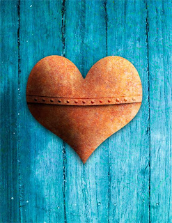
Above is an image I created as an example for a seminar I taught on Channels and Blending Modes. What I want to discuss here is how I created the Blue Wood background for the rusty heart to sit on. 

To begin with I dipped into my library of textures and found this shot of some wood that I took on a dock in New York a few years ago. 


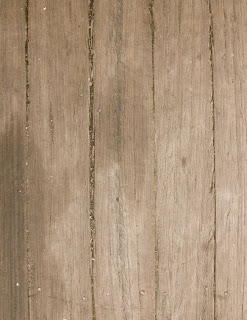
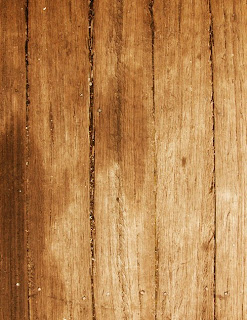
As you can see it's sort of interesting, but a bit flat and it lacks the "punch" I wanted the background to have. After doing a little contrast enhancement I added a Curves Adjustment Layer set to "Overlay" Blending. (Yes, you can use blending modes with Adjustment Layers. In fact it doing this gives you exactly the same result as adding a copy of the image and setting that to the same blending mode - but it adds almost nothing to your file size.) So after this step this is what the wood background looked like.


OK, now we're getting something interesting. This has much more drama to it and will work a lot better with the Rusty Heart. But a warm background and a warm foreground image won't really work well together here so I needed to shift the color to make the heart "pop" more. That's when I looked for another texture to add to the wood. Again a trip to my textures library led me to this shot of some water in a fountain that I took several years ago while taking my oldest daughter to Summer Camp.


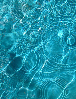
The blue of this water looked like it would work well as a way to set off the heart I had made and so I placed a copy of the water over the adjusted wood image and tried out different blending modes. In this case I really just wanted to use the color of the water to make the wood pick up the blues in the image. I also liked the variety in the color that the highlights from the ripples added and wanted to use those as well. 

Of all the blending modes Photoshop gives us there are two that primarily affect color: "Color" and "Hue". The main difference here is that the "Color" mode will affect the saturation of the layers below while the "Hue" mode won't. In playing with the two modes I chose Hue and got this result:


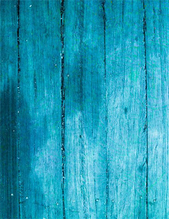
Now that's more like it! By combining a couple of images as textures and playing with their blending modes I went from the drab looking wood to this much more interesting wood that worked much better as a background for the rusty heart. Here is a larger example of what the final image looked like.


Now the bigger question is what textures do you have to play with?

Saturday, June 28, 2008

Burnin' & Dodgin' on a layer

One of the most useful techniques in working on an image is to do selective burning and dodging, that is carefully darkening and lightening parts of an image to define edges, create a sense of detail or even to add "shape" to a part of the image.

As a digital artist I've seen many different ways of doing this, and most work pretty well. The most common way is to make a copy of the layer and just use the burn and dodge tool in Photoshop. While this can be effective I personally find it limiting and inefficient.

It's limiting because it's hard to adjust what you've done after the fact, and inefficient because every time you need to copy a layer you're making your file bigger and forcing Photoshop and the computer to do more work.

Here's a simpler way: Create a new layer, set the blending mode to "Overlay" and then using a brush paint White to lighten and Black to darken. When I'm working with this technique I use a low opacity on the brush so I can more easily control how much I'm lightening or darkening the image. Also don't fill the layer with Neutral Gray, it's really unnecessary and just makes the layer bigger.

Overlay is one of three blending modes that affects the contrast of an image depending on how much lighter or darker than neutral gray the values are. White and Black will produce the strongest effect and shades of light or dark gray produce gentler effects.

One thing to look out for when working this way is that sometimes the colors in the image may gain an unnatural looking saturation when you use a strong effect. For this reason I'll frequently use one Overlay layer to darken and another to Lighten. Doing it this way makes it easier for me to change what I've done. For instance if I like the way the Lightening worked but wanted to back off on the Darkening I can just lower the opacity of the Darkening Layer leaving the Lightening Layer alone.

It takes some experimentation, but as with anything the more you play with it the better your control will be.

Wednesday, June 25, 2008

Starting Out

As a digital artist I tend to look at images trying to find easier ways to get certain looks or effects. When a group of photographer friends were discussing various in camera techniques they used one of them shared a self portrait he had done where he really liked the pronounced blue tone he had achieved.

I liked the look, but thought his process didn't give him much control so I opened up a shot he had done of me and started to play with various ways to get a similar effect. Turned out it was pretty easy.

Here is the shot I chose to play with:
And here is the final Blue version:


To get this effect all I did was play with Photoshop's Curves Adjustment Layer. If you set the blending mode to "Color" and then push and pull the curves about you'll find that the only thing you're affecting is the color and saturation of the image. Pulling down on the Red Curve will take Red out of the image, but won't make it any darker or affect the contrast either.

So for this image I created a Curves Adjustment Layer, set the blending to "Color" and then went to the Blue Curve and pulled the bottom point all the way to the top so it was a flat line adding all the blue it could to the image.

Then to get just the shade of Blue I wanted I took some Red and some Green out as well. Finally I toned down the saturation by going to the RGB Composite Curve and pulled the white point (the one in the upper right corner) straight down until I liked the saturation.

Here is a screen grab of what the adjustments in Photoshop looked like:It's great that Photoshop now lets you see what's happening in all the channels at once. Here you can see that I took almost all of the Red out of the image and most of the Green as well. All in all it took about 5 or 10 minutes of playing to create this look. The thing I like best about working in digital imaging is that it's so easy to play with something until you get what you want. The more you do it the easier it gets to see how to get there.

Try playing with this idea on some of your own images and see what "Looks" you can create.